Appearance
Integrating Ogma with React
The following tutorial will show how to create a Ogma component using React classes.
You may also want to check out the @linkurious/ogma-react wrapper for seamless integration between Ogma and React.
You can install it via npm or yarn.
sh
npm i -S @linkurious/ogma-reactThe component is called OgmaComponent and it exposes all Ogma events in a React fashion, providing a simple way to customise it with different actions.
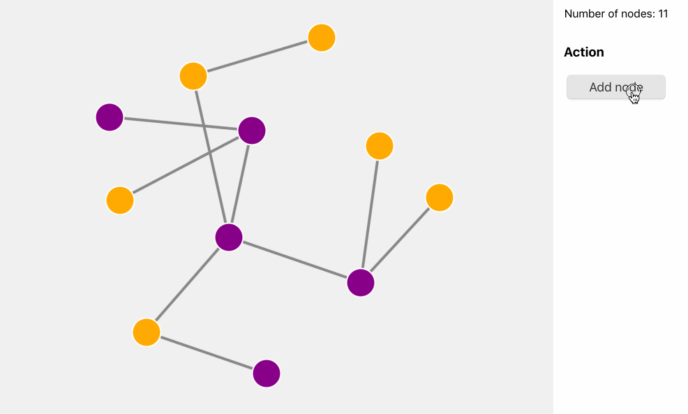
The final goal of this tutorial is to build a basic React web application with Ogma that:
- Add a node via a button
- Shows a tooltip - the React way - with information on the node
- An advanced expand-like feature with 2 different layouts
As first step the OgmaComponent component should create a Ogma instance when mounted:
jsx
import React, {PureComponent} from 'react';
import Ogma from '@linkurious/ogma';

// PureComponent or Component as both good, the former performs a bit better in this case
class OgmaComponent extends PureComponent {
    ...

    componentDidMount() {
        // create the Ogma instance
        this.ogmaRef = new Ogma({
            container: 'ogma-react',
            options: {
                backgroundColor: 'rgb(240, 240, 240)'
            },
            graph: this.props.data
        });

        this.ogmaRef.layouts.force({ locate: true });
    }

    render() {
        return <div id='ogma-react' style={{width: 800, height: 600}}> </div>
    }
}

export default OgmaComponent;
At this point this.ogmaRef holds the Ogma instance and it is possible to use it to bind events to it and more within the component.
Add the data
As shown in the code snippet above the component accepts a data prop from its parent component, that contains the graph data to show.
This is the parent component App.js:
jsx
import React, { Component } from 'react';

import InfoPanel from './InfoPanel';
import ControlPanel from './ControlPanel';
import Tooltip from './Tooltip';
import OgmaContainer from './OgmaComponent';
import initialGraph from './data';

import './App.css';

// external helpers
function createNode(id) {
  return {
    id,
    attributes: {
      color: id % 2 ? 'purple' : 'orange'
    }
  };
}

function createEdge(node, nodesInGraph) {
  // pick a random node in the graph
  const randomIndex = Math.floor(Math.random() * nodesInGraph.length);
  const otherNode = nodesInGraph[randomIndex];
  return {
    id: `${otherNode.id}-${node.id}`,
    source: otherNode.id,
    target: node.id
  };
}

export default class App extends Component {
  state = {
    counter: initialGraph.nodes.length,
    graph: initialGraph
  };

  addNode = () => {
    const newNode = createNode(this.state.counter);
    // note: we're creating a new array here, adding an extra node at the end
    const nodes = [...this.state.graph.nodes, newNode];
    const edges = [
      ...this.state.graph.edges,
      createEdge(newNode, this.state.graph.nodes)
    ];
    // use the counter as id
    this.setState({
      graph: { nodes, edges },
      counter: this.state.counter + 1
    });
  };

  render() {
    return (
      <div className="App">
        <OgmaContainer data={this.state.graph} />
        <div className="text-center">
          <InfoPanel nodes={this.state.graph.nodes.length} />
          <ControlPanel onAddClick={this.addNode} />
        </div>
      </div>
    );
  }
}
The ControlPanel component contains a button that calls the addNode handler in the App.js component. The addNode function creates a new node and a new edge, append them to the current item lists and creates a new graph object to be stored into the local state. This triggers a new render where this.state.graph is passed as data to the OgmaContainer component.
In the first OgmaComponent implementation, it is only loaded the graph once, on creation - there's no update code yet.
jsx
import React, { PureComponent } from 'react';
import Ogma from '@linkurious/ogma';

// PureComponent or Component as both good, the former performs a bit better in this case
class OgmaComponent extends PureComponent {
  // after a component update, add the new data, then layout
  componentDidUpdate(prevProps) {
    // add a node
    if (prevProps.data.nodes.length < this.props.data.nodes.length) {
      // update the data in ogma
      return this.ogmaRef
        .addGraph(this.props.data)
        .then(() => this.ogmaRef.layouts.force({ locate: true }));
    }
  }

  componentDidMount() {
    // create the Ogma instance
    this.ogmaRef = new Ogma({
      container: 'ogma-react',
      options: {
        backgroundColor: 'rgb(240, 240, 240)'
      },
      graph: this.props.data
    });

    this.ogmaRef.layouts.force({ locate: true });
  }

  render() {
    return (
      <div id="ogma-react" style={{ width: 800, height: 600 }}>
        {' '}
      </div>
    );
  }
}

export default OgmaComponent;
Now the chart can be updated with new nodes!
Add the tooltips
Ogma comes with the whole events namespace already exposing many different event hooks: we can leverage such namespace in React as follow:
js
import React, {PureComponent} from 'react';
import Ogma from '@linkurious/ogma';
// PureComponent or Component as both good, the former performs a bit better in this case
class OgmaComponent extends PureComponent {
...
componentDidMount() {
// create the Ogma instance
this.ogmaRef = new Ogma({
container: 'ogma-react',
options: {
backgroundColor: 'rgb(240, 240, 240)'
},
graph: this.props.data
});
this.ogmaRef.layouts.force({ locate: true });
// See the Ogma.events namespace: https://doc.linkurio.us/ogma/latest/api/ogma/events
this.bindEvents()
}
// when passed a on* event as React prop it checks it and bind it to the ogma instance
bindEvents() {
Object.keys(this.props).forEach(prop => {
if (/^on/.test(prop) && prop in this.ogmaRef.events) {
this.ogmaRef.events[prop](this.props[prop]);
}
});
}
render() {
return <div id='ogma-react' style={{width: 800, height: 600}}> </div>
}
}
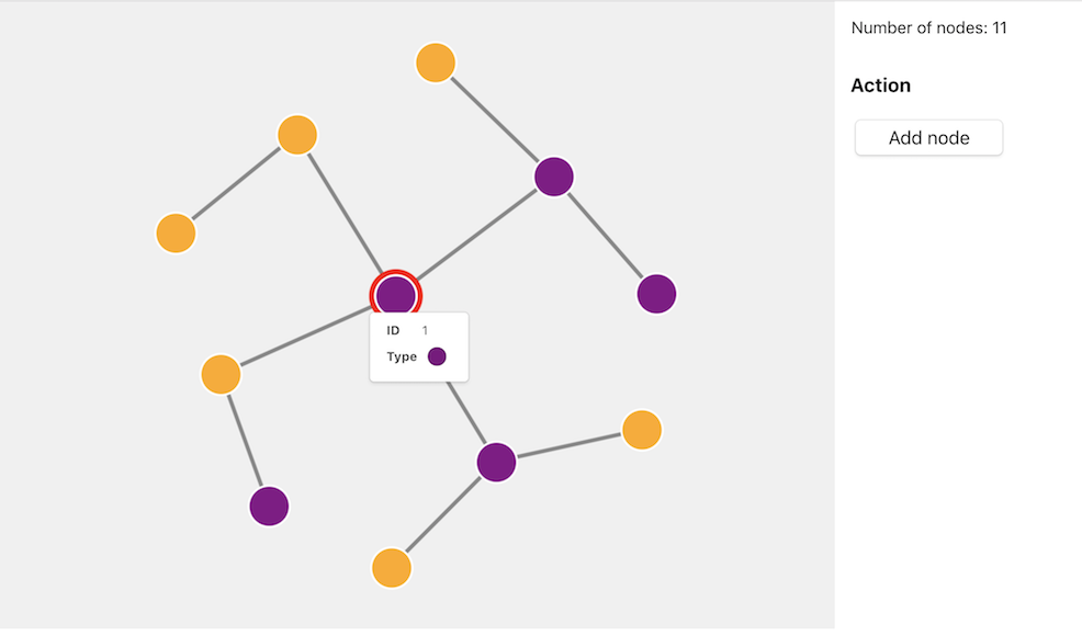
export default OgmaComponent;This makes possible to attach any event listener function (for instance onNodeClick or onHover) when using the component in React. In the current tutorial the onHover and onUnhover events are used to show/hide a tooltip on nodes.
First it requires a simple Tooltip to be created:
jsx
import React from 'react';

export default function Tooltip({ position, data }) {
  return (
    <div className="tooltip" style={{ top: position.y, left: position.x }}>
      <div className="tooltip-content">
        <table>
          <tbody>
            <tr>
              <td>
                <strong>ID</strong>
              </td>
              <td>{data.id}</td>
            </tr>
            <tr>
              <td>
                <strong>Type</strong>
              </td>
              <td>
                <div
                  className="circle"
                  style={{ background: data.attributes.color }}
                ></div>
              </td>
            </tr>
          </tbody>
        </table>
      </div>
    </div>
  );
}
The Tooltip components receives two specific information from its parent (App.js): the data to show and the position where to be placed.
Both information will come from the Ogma hover/unhover events: the App.js component listens to the Ogma event and update its local state, then propagated to the Tooltip component.
jsx
import React, { Component } from 'react';

import InfoPanel from './InfoPanel';
import ControlPanel from './ControlPanel';
import Tooltip from './Tooltip';
import OgmaContainer from './OgmaComponent';
import initialGraph from './data';

import './App.css';

...

export default class App extends Component {

  state = {
    counter: initialGraph.nodes.length,
    graph: initialGraph,
    // tooltip state
    tooltipPosition: null,
    tooltipNodeId: null
  }

  ...
  // on hunover clear the tooltip state
  onNodeUnHover = () => {
    // clear the tooltip state
    return this.setState({
      tooltipPosition: null,
      tooltipNodeId: null
    });
  }

  // on hover save the position and the id of the hovered item/node
  onNodeHover = ({ x, y, target }) => {
    if (target.isNode) {
      // save the tooltip state (offset by 20px the vertical position)
      this.setState({
        tooltipPosition: { x, y: y + 20 },
        tooltipNodeId: target.getId()
      });
    }
  }

  handleTooltip(){
      // check if there's a position stored for the tooltip
    const nodeTooltip = this.state.tooltipPosition ? this.state.graph.nodes.find(node => node.id === this.state.tooltipNodeId) : null;

    if(!nodeTooltip){
        // nothing in the state, drop it
        return;
    }
    // show the tooltip
    return <Tooltip
            position={this.state.tooltipPosition}
            data={nodeTooltip} />
  }


  render() {
    return (
      <div className="App">
        <OgmaContainer
            data={this.state.graph}
            onHover={this.onNodeHover}
            onUnhover={this.onNodeUnHover}  />
        {this.handleTooltip()}
        <div className="text-center">
          <InfoPanel
            nodes={this.state.graph.nodes.length} />
          <ControlPanel
            onAddClick={this.addNode}  />
        </div>
      </div>
    );
  }
}
Because of the generic binding in the OgmaComponent, the onHover and onUnhover handlers are already available in JSX.
Layout picker - Advanced
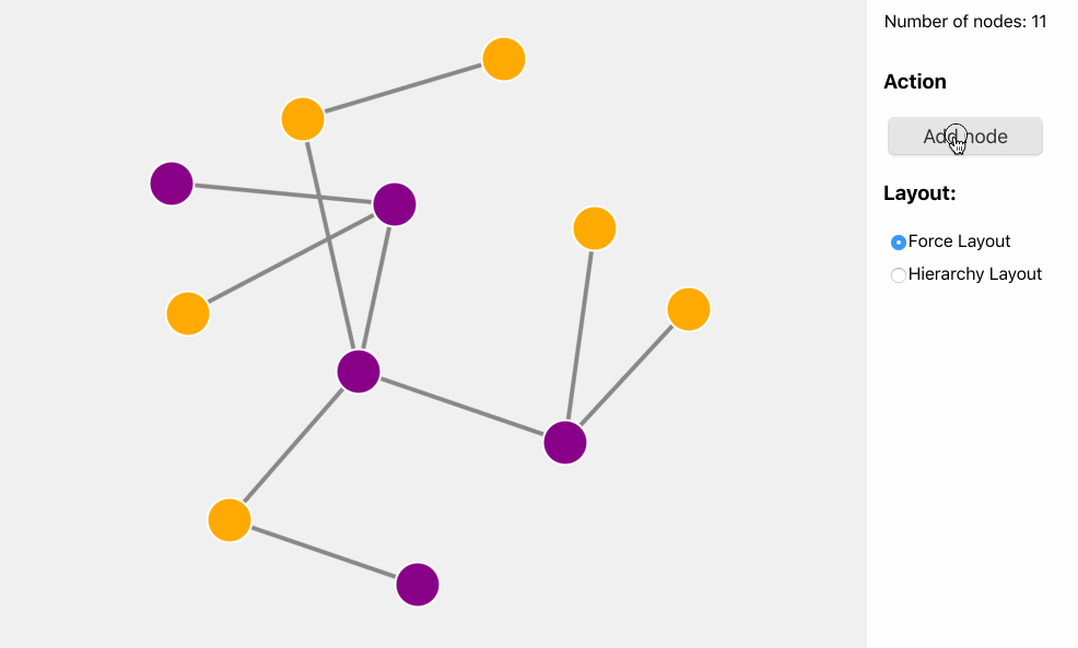
This is an advanced step to complete the tutorial: when a node is added to the graph, the user can decide which layout to apply to the expand-like feature.
The ControlPanel component needs to be updated to have two radio inputs, and a handler when the click happens:
js
import React from 'react';

export default function ControlPanel({ onAddClick, onLayoutChange, value }) {
  return (
    <div className="form">
      <h3>Action</h3>
      <button className="btn" onClick={onAddClick}>
        Add node
      </button>
      <h3>Layout:</h3>
      <label className="radio">
        <input
          type="radio"
          name="layout"
          value="force"
          onChange={onLayoutChange}
          checked={value === 'force'}
        />
        Force Layout
      </label>
      <label className="radio">
        <input
          type="radio"
          name="layout"
          value="hierarchical"
          onChange={onLayoutChange}
          checked={value === 'hierarchical'}
        />
        Hierarchy Layout
      </label>
    </div>
  );
}
Then the main App.js component needs to have a new state layout and pass it to both ControlPanel and OgmaComponent:
jsx
import React, { Component } from 'react';

import InfoPanel from './InfoPanel';
import ControlPanel from './ControlPanel';
import Tooltip from './Tooltip';
import OgmaContainer from './OgmaComponent';
import initialGraph from './data';
...

export default class App extends Component {

  state = {
    counter: initialGraph.nodes.length,
    graph: initialGraph,
    // tooltip state
    tooltipPosition: null,
    tooltipNodeId: null,
    // which layout to use?
    layout: 'force'
  }

  onLayoutChange = ({ target }) => this.setState({
    layout: target.value
  })


  ...


  render() {
    const nodeTooltip = this.state.tooltipPosition ? this.state.graph.nodes.find(node => node.id === this.state.tooltipNodeId) : null;
    return (
      <div className="App">
        <OgmaContainer
          data={this.state.graph}
          onHover={this.onNodeHover}
          onUnhover={this.onNodeUnHover}
          layout={this.state.layout} />
        {nodeTooltip && <Tooltip position={this.state.tooltipPosition} data={nodeTooltip} />}
        <div className="text-center">
          <InfoPanel nodes={this.state.graph.nodes.length} />
          <ControlPanel
            onAddClick={this.addNode}
            onLayoutChange={this.onLayoutChange}
            value={this.state.layout} />
        </div>
      </div>
    );
  }
}
And last the OgmaComponent needs to use the new prop layout that is passed through:
jsx
import React, { PureComponent } from 'react';
import Ogma from '@linkurious/ogma';


export default class OgmaComponent extends PureComponent {

    componentDidUpdate(prevProps) {
        // add a node
        if (prevProps.data.nodes.length < this.props.data.nodes.length) {
            // update the data in ogma
            return this.ogmaRef.addGraph(this.props.data)
                .then(() =>
                    // use the passed layout after adding the node
                    this.runLayout()
                );
        }

        // if the layout changes, then run it
        if(prevProps.layout !== this.props.layout){
            return this.runLayout()
        }
    }

    runLayout(){
      const options = {locate: true};
      if(this.props.layout === 'hierarchical'){
        // set node with ID = 1 as root of the hierarchy. Shown as an example to customise options per-layout
        // Alternatively the layout can work out the root automatically, or we could use user's selection.
        options.roots = [1];
      }
      return this.ogmaRef.layouts[this.props.layout](options);
    }
    ...

    render() {
        return <div id='ogma-react' style={{width: 800, height: 600}}> </div>
    }
}
The layout function has been refactored to a generic runLayout function on the component that handles the logic in a centralised way.
This is the final result: